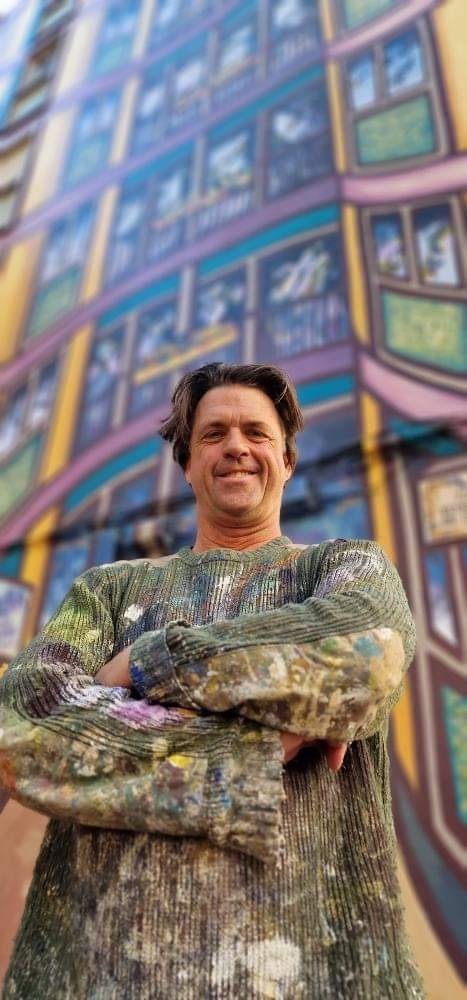
La Vidriera
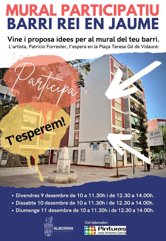
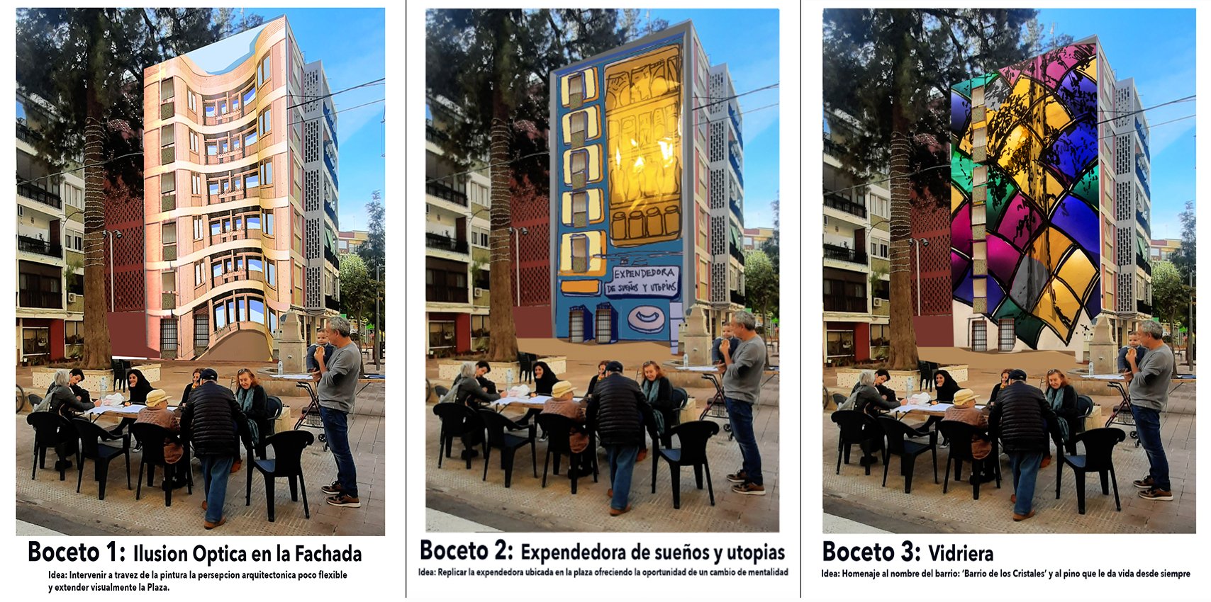
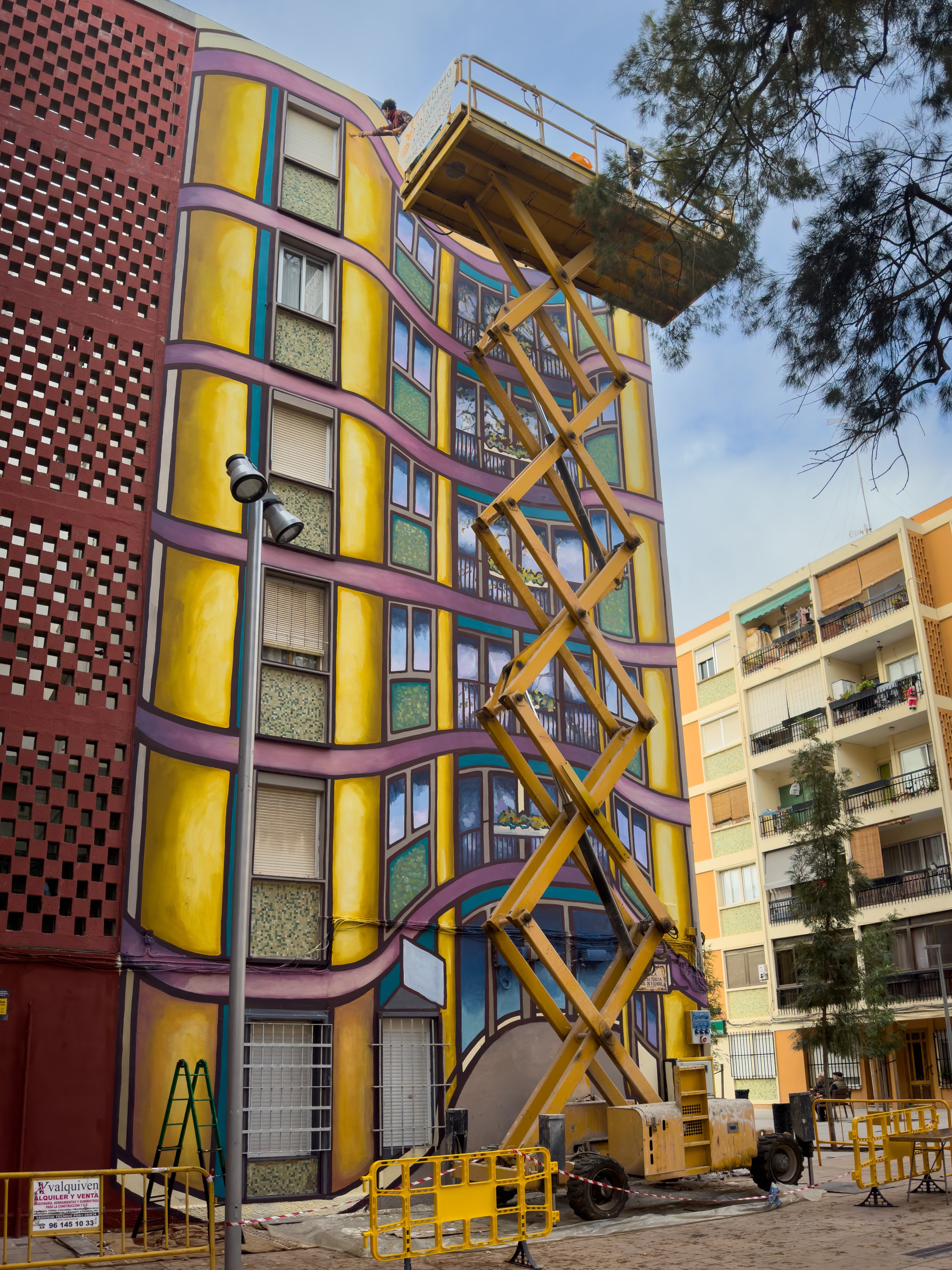
During the 3 day participatory process we sat on the square asking people for ideas. We had to produce three sketches to be voted for before we could start painting. Our favourite idea won, which was to take on the rigid, repetitive architecture and make it wobble with a visual illusion.
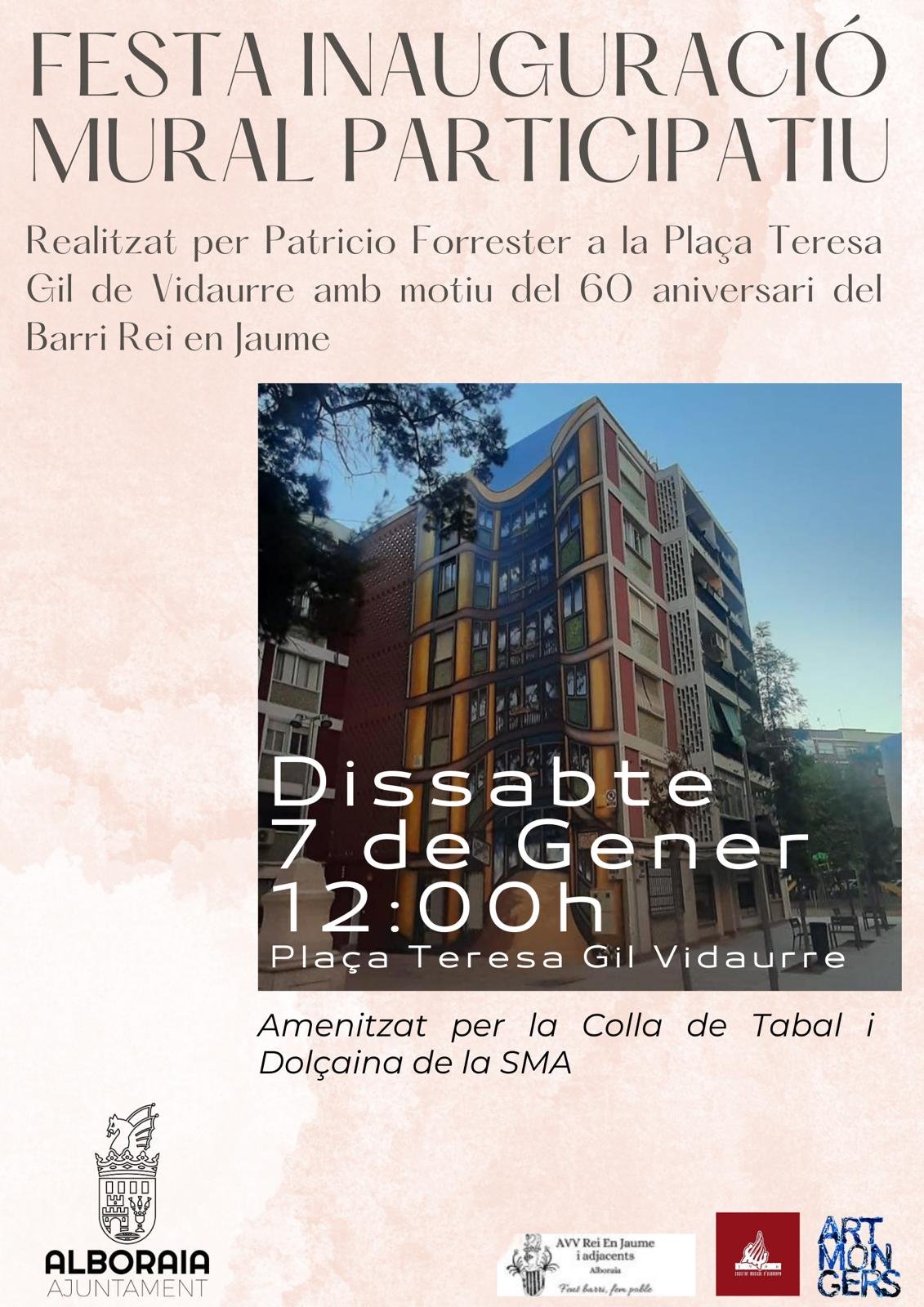
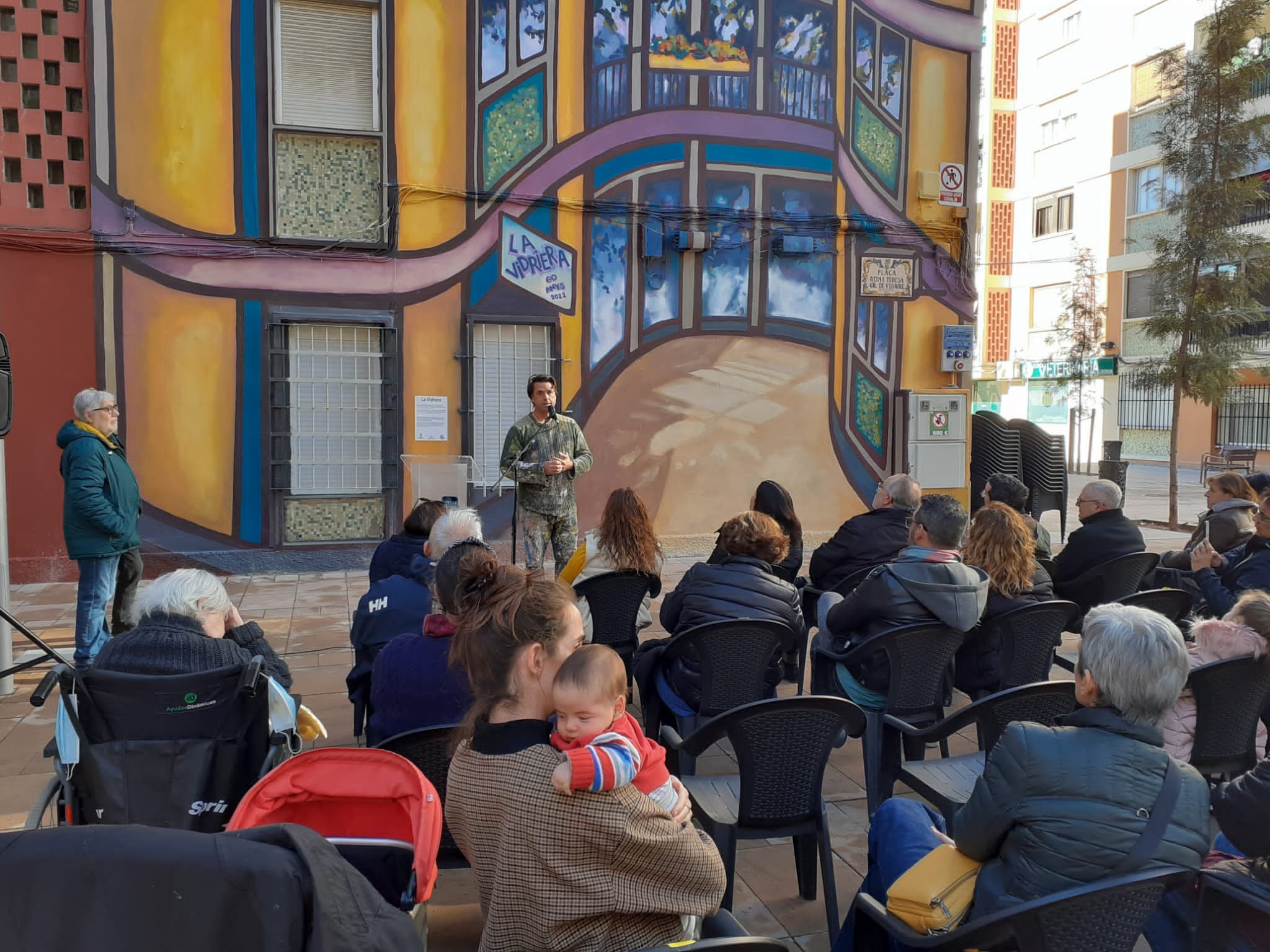
We were commissioned by the Ayuntamiento de Alboraya to create a participatory mural that celebrated its 60th anniversary. El Barrio de los Cristales is a neighbourhood that has a really strong working class identity and where the social fabric is very tightly knitted. We began by engaging the resident association to get a sense of context and ambitions for the new arriving image. One lady said: I would like the mural to bring splendour to the square, while another wanted the mural to continue and enlarge the space. Historically segregated on the wrong side of the train tracks, even after they were removed from street level, the frontier was still felt by the residents daily.
Everything that is going on in the neighbourhood is talked about at the local Bakers Amparo. She would ask every customer about the mural, which sketch they liked most, if there was any concerns, etc, we would hear about it through her.
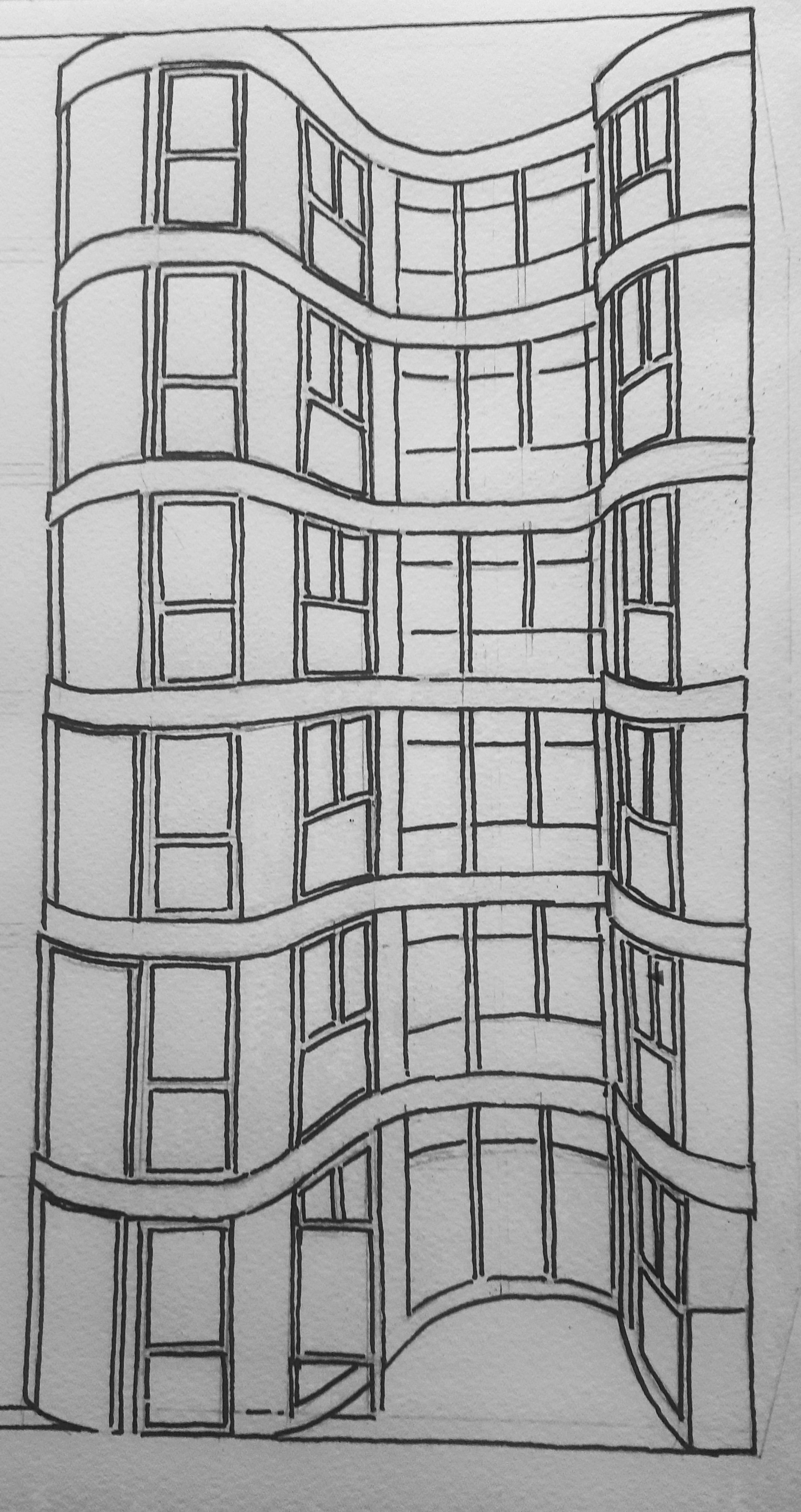
We usually want to paint murals that reflect on its immediate environment first and then on the wider context - a sort of marriage between the wall, its circumstances and the new image. We are weary of importing images and narratives that won’t settle well with the physical context as everyone will have to live with it for a long time. We like to paint murals that look as if they have always been there. It is part of our process to consider various aspects before we settle on any ideas. Anyhow, we were thinking about what we could paint when Amparo turned up with the original architect´s drawings. We held them for a while but one day, on our way to pick up our delicious take away paella, we had a moment of inspiration. It dawned on us that we could use those drawings in such a way that they would transform any straight, harsh lines into beautiful curves. We wanted to create a the sense that what is seen as rigid and square could be potentially become fluid, flexible and even wonky.
The starting point was the need to incorporate a line of existing windows. In the drawing below we studied how the windows on the right hand side would incorporate themselves to the curvaceous visual illusion.
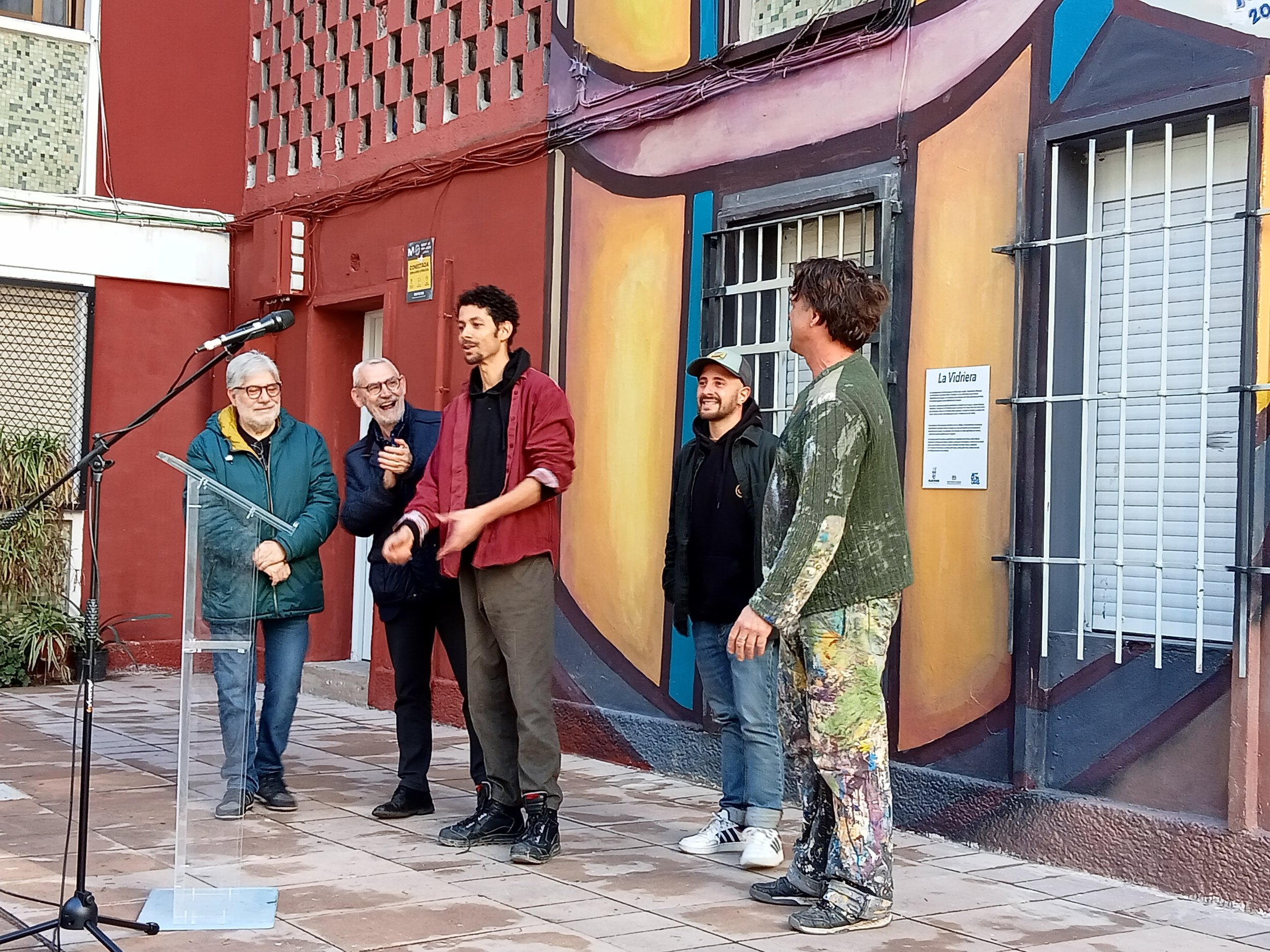
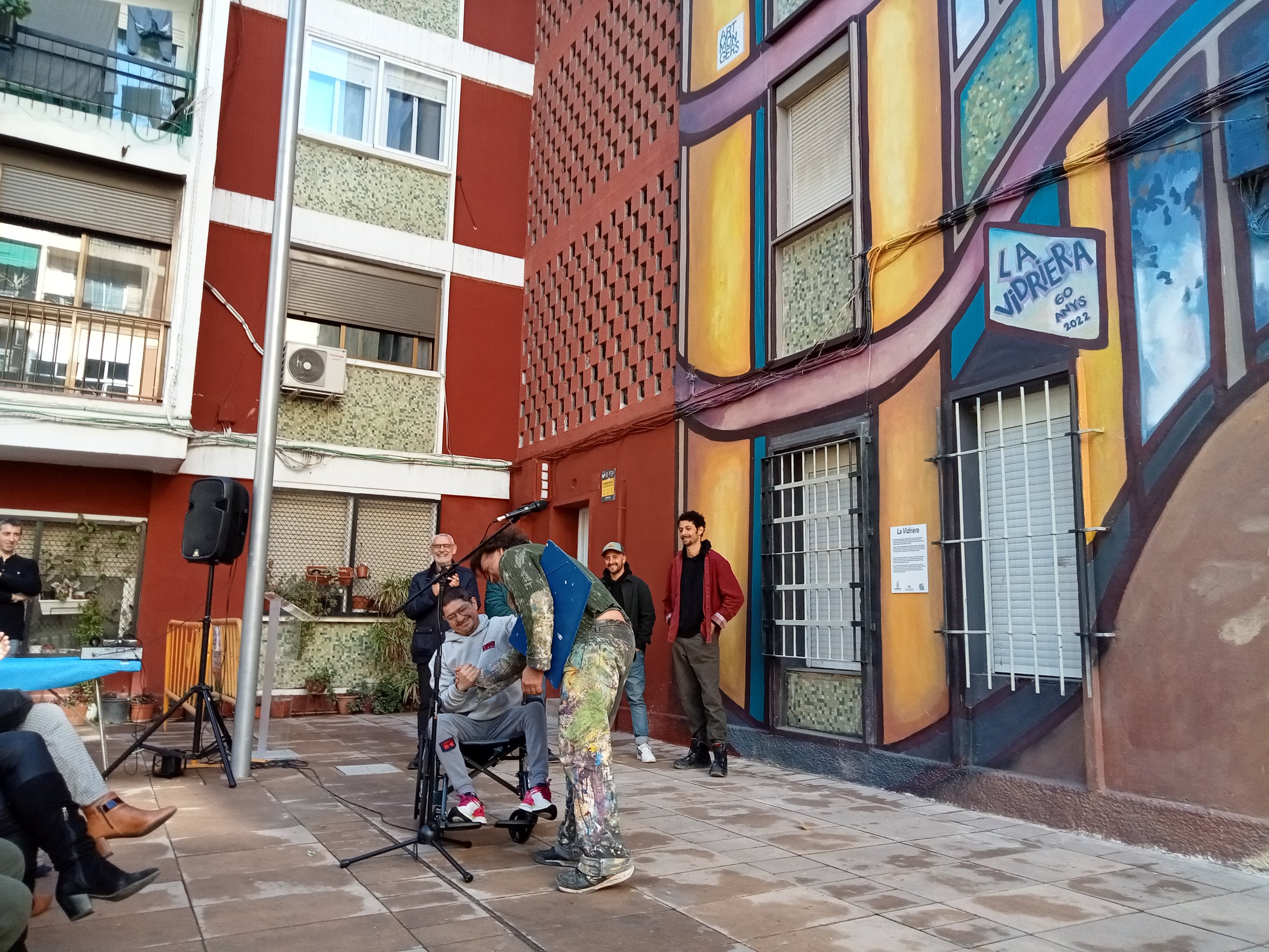
We got a small budget to pay for two local apprentices to come and learn with us during the 9 days it took to paint the mural. Nabil seen here stretching out to paint, and Joel. Both were fantastic help and good to help them with new skills for their own mural practice.
At one point, we asked an elderly resident what should be paint. We took his time to thing about it and then said: A pissing dog! He had been very irritated to see dog owners not cleaning up up the mess for year. So this for him, was subversive revenge.
De
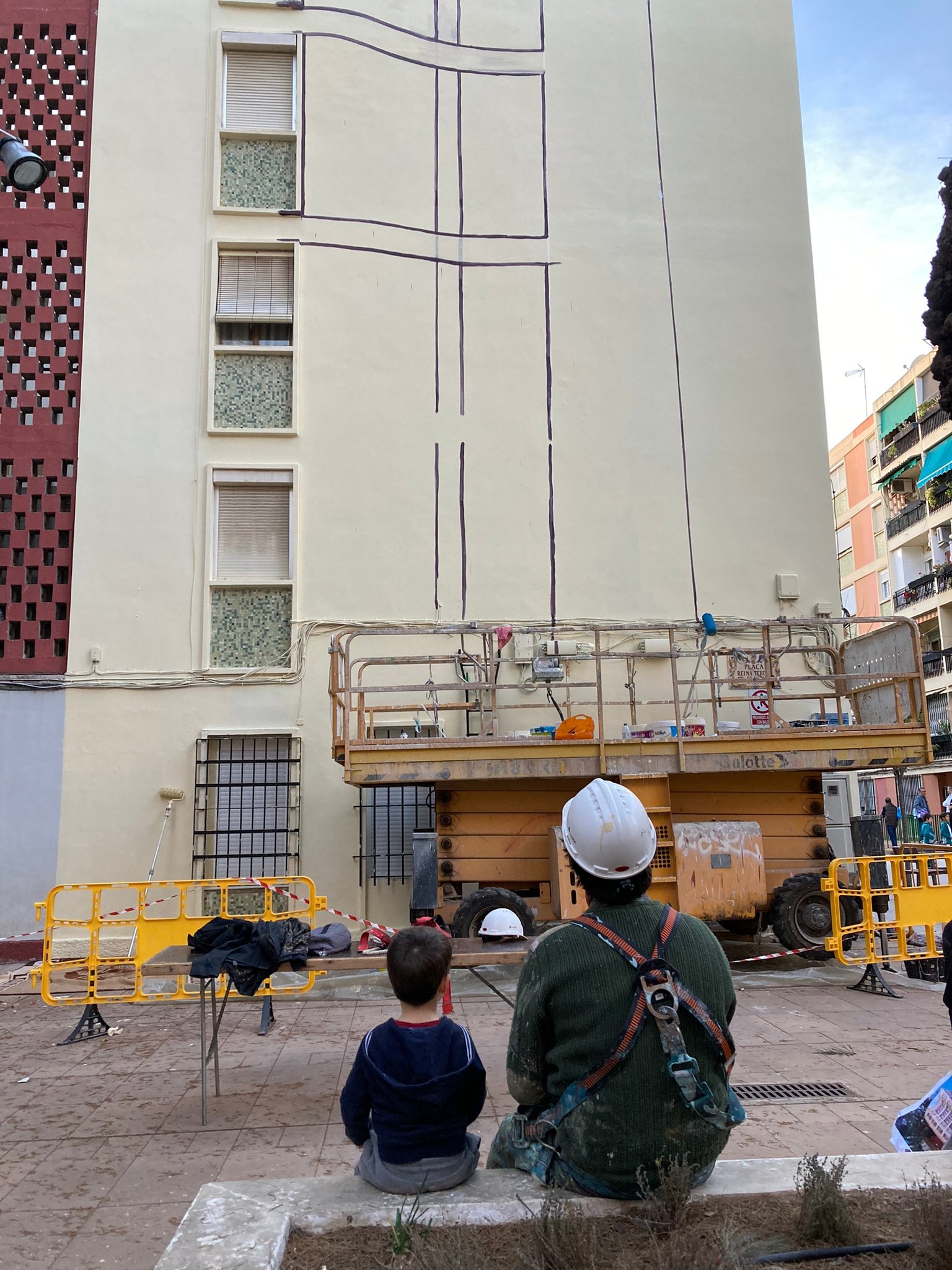
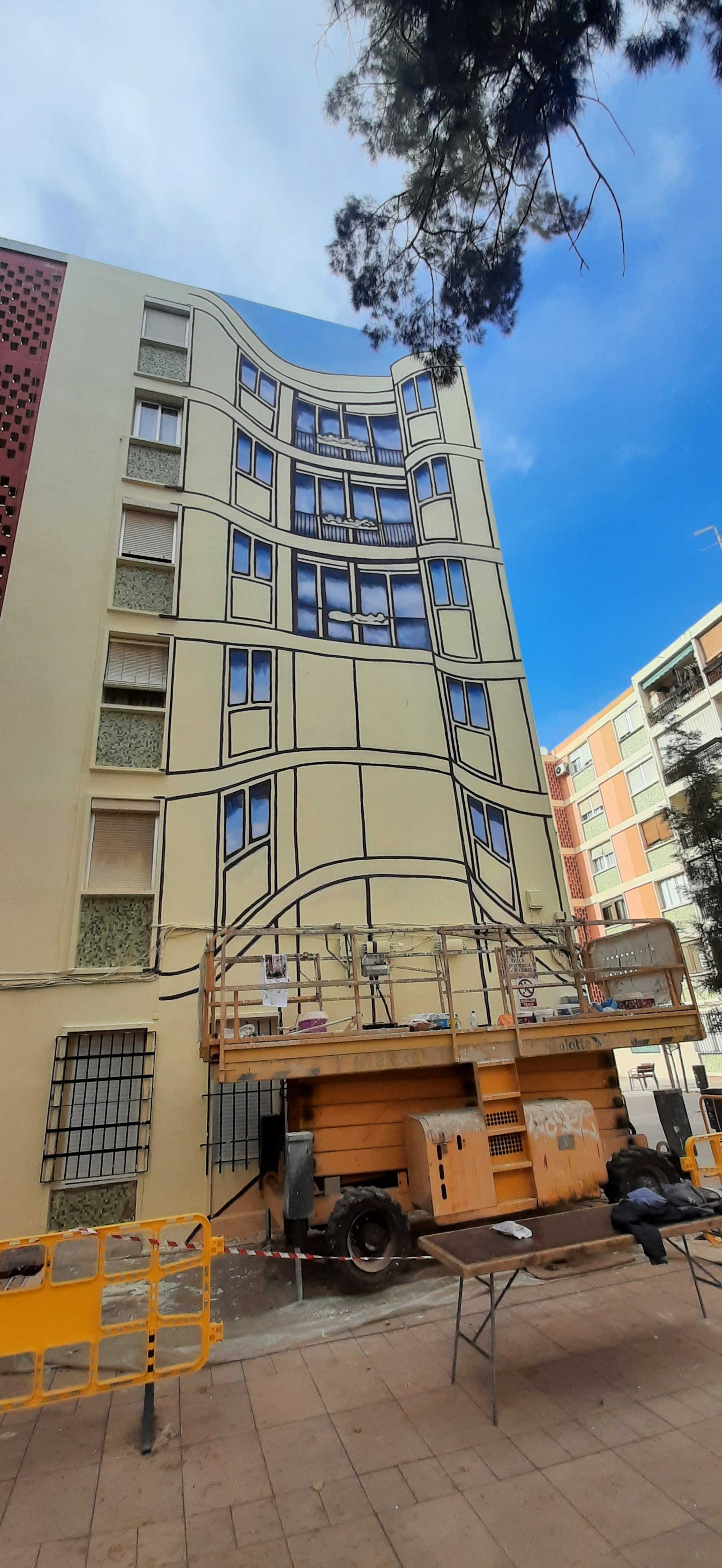
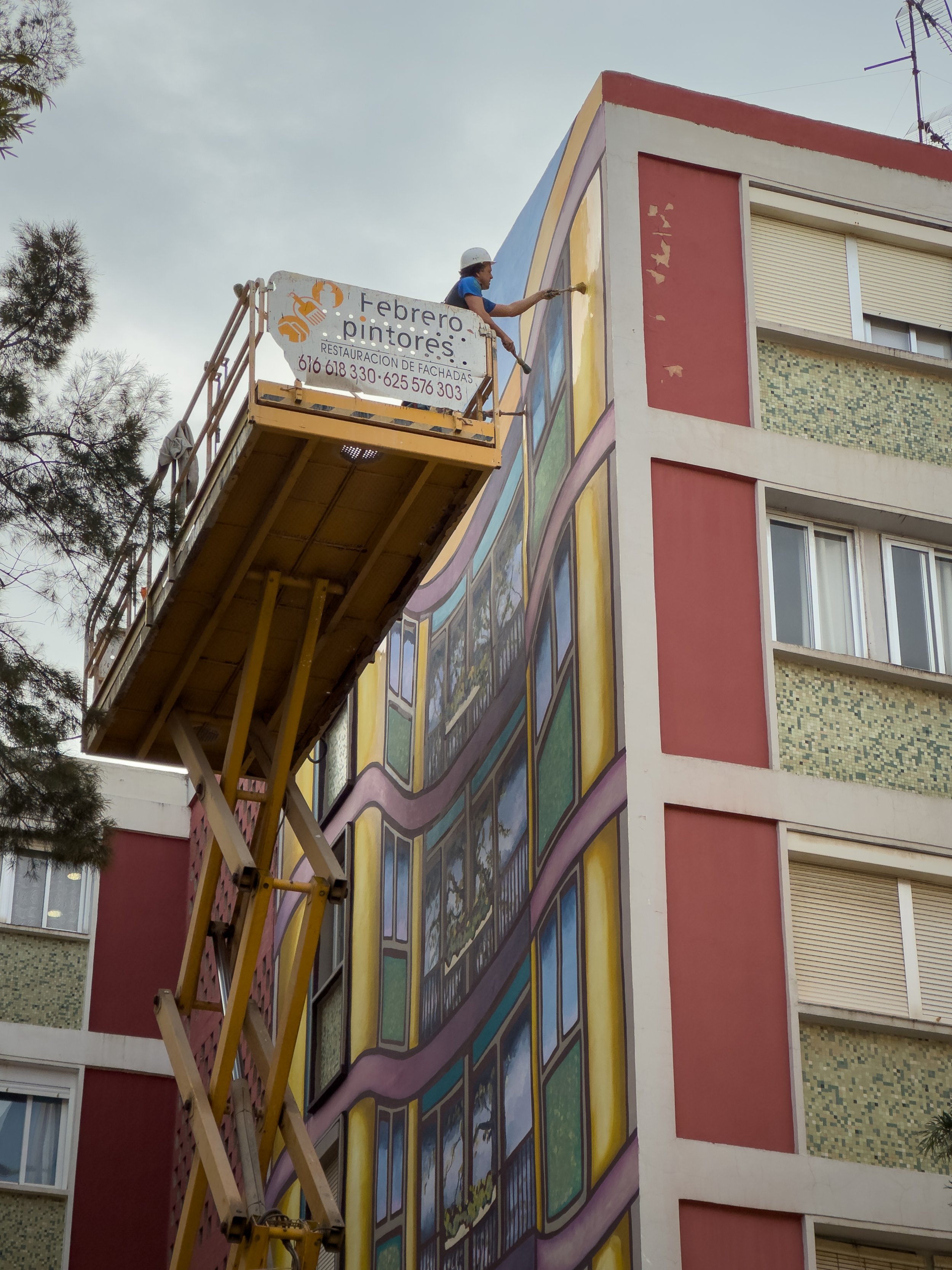
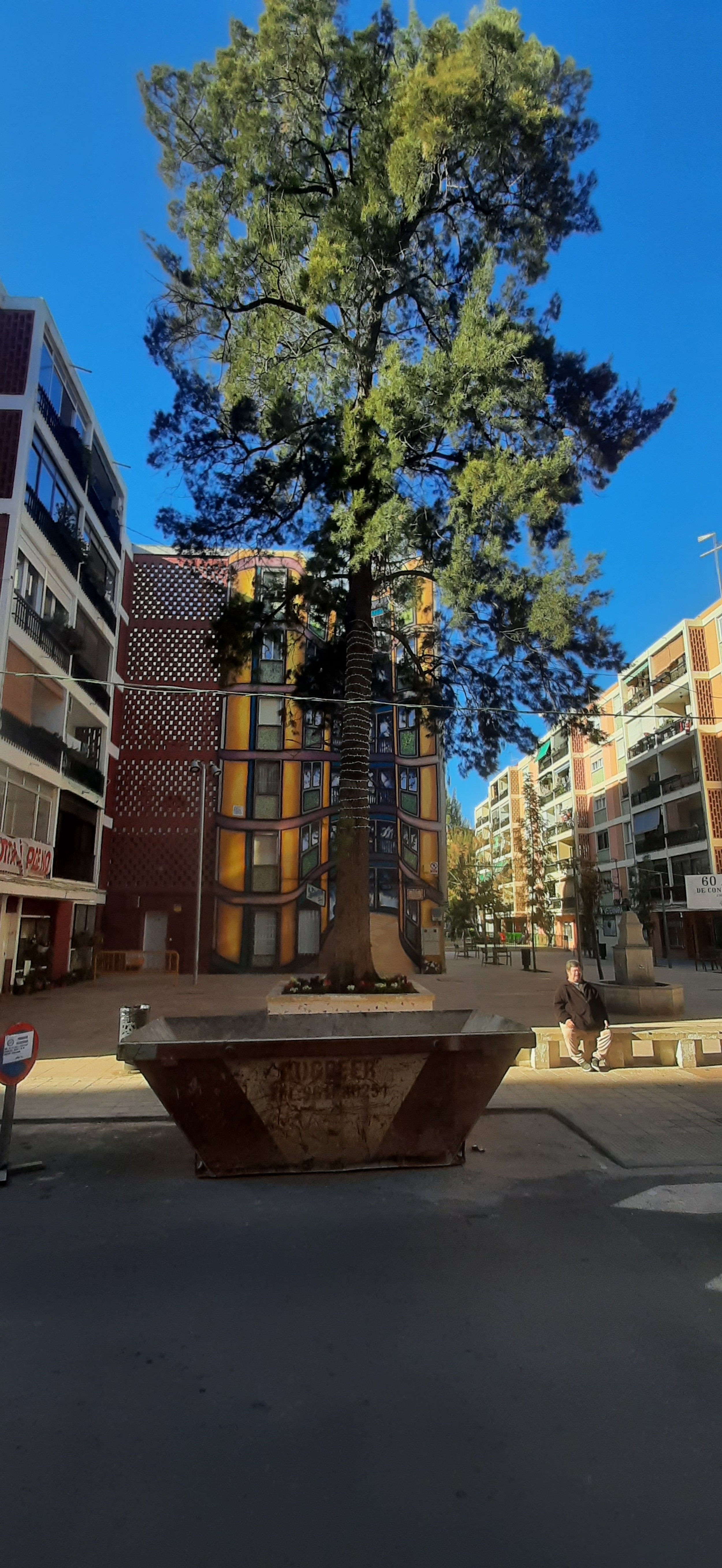
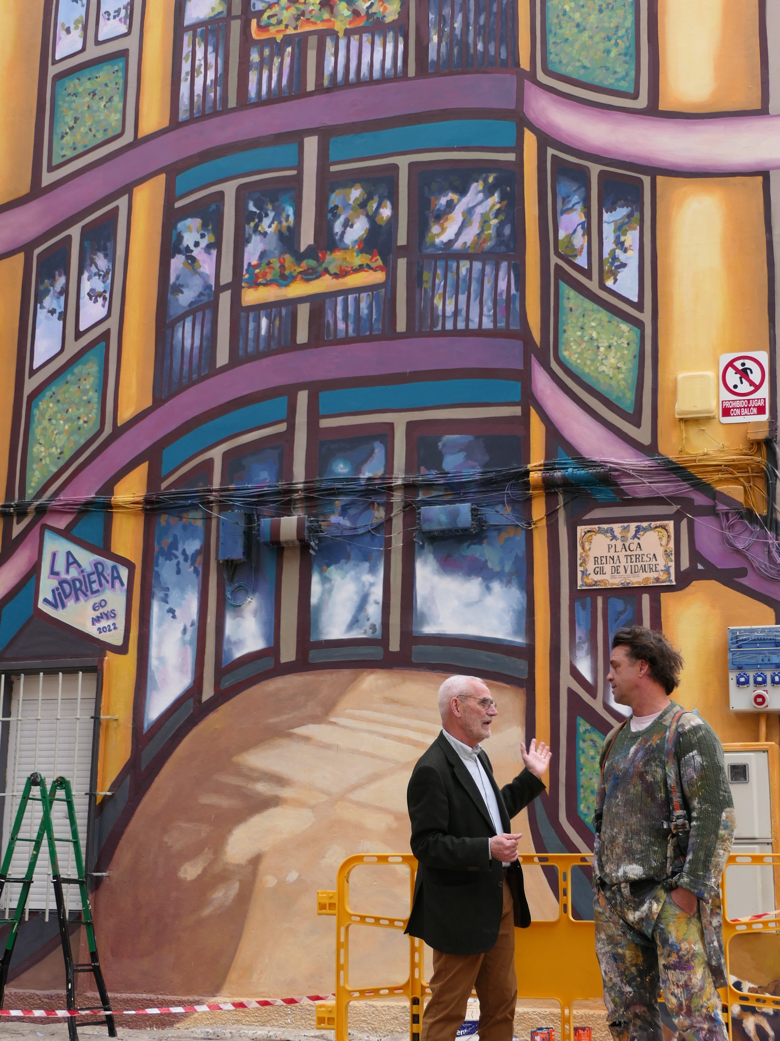
Once we had the structural lines in, we did improvised a lot and had fun to bring the image alive though color and the reflexions of the pine on the windows.
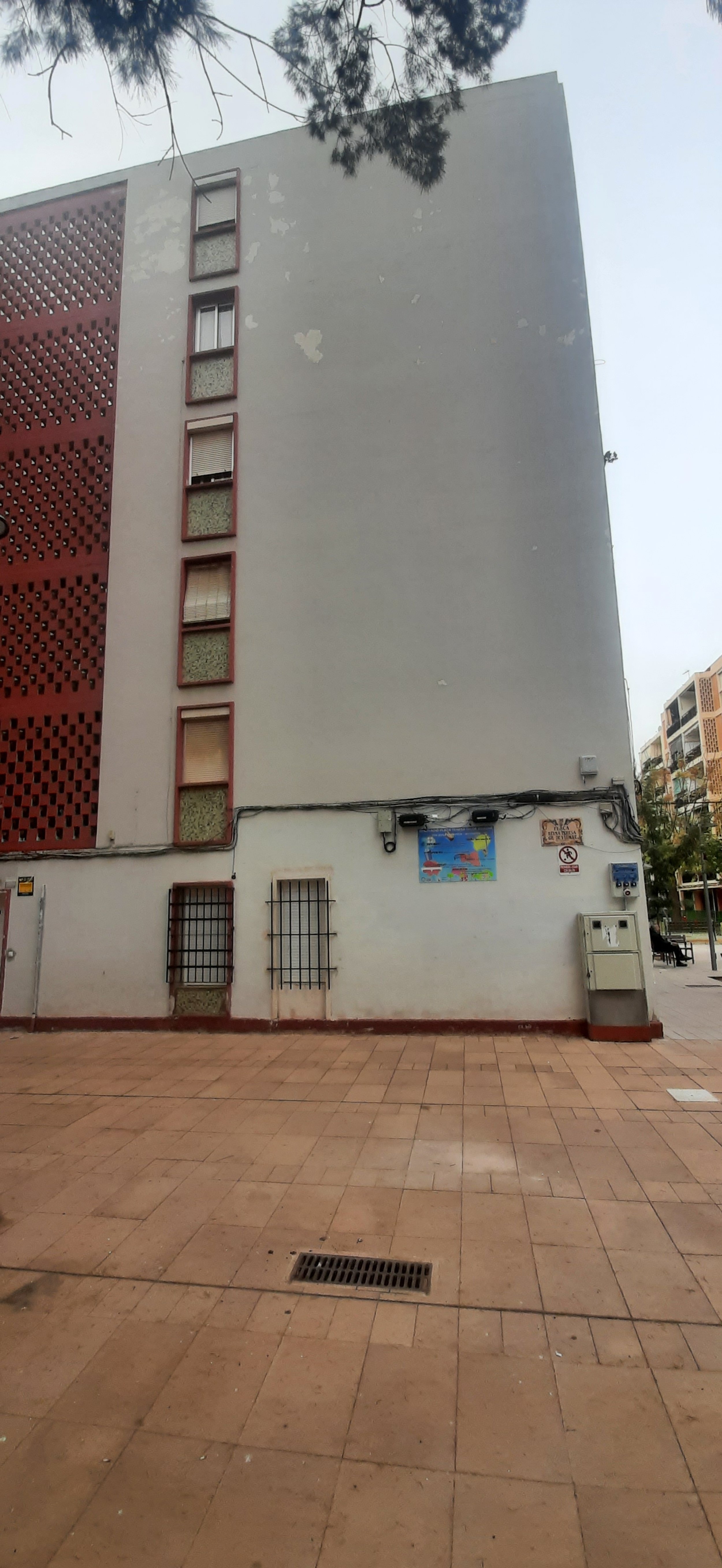
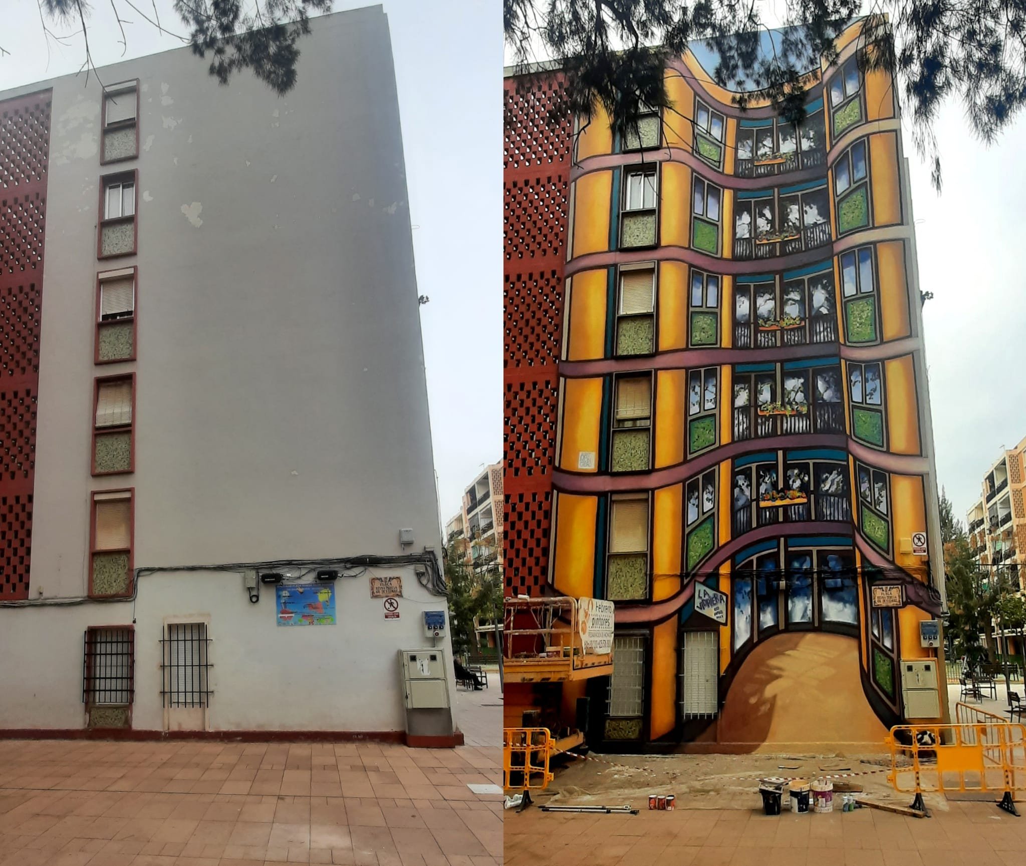
So you can see in the gallery down below, the process from beginning to end: the wall as it was before we started, the call out, the three sketches. If you look at the windows with the bare wall and cable line, you can see it was quite a complicated space to work with. As it is to be expected, our ideas changed a lot in the process.
The way the windows were integrated in the final design led a passerby to be tricked into feeling the mural was moving while in fact someone simple looked out of their window. The strenght of the lines in the chosen design really trick the eye, bending the picture plain and destroying in the viewer, the ability to see where the wall actually is. Doubt and certainty expressed at once.
